
PDP 1

(Professional Development Project. Week 1: first update.)

Over the past year, as I finished up my AS in Computer Science, as I’ve been a participant in the Praxis program, I spent a good deal of time gaining entry-level skills in a variety of technological areas: SQL, systems analysis, web development skills including HTML, CSS, and JavaScript, etc. After all that, I wanted to pick something to focus on for continuing professional development.

As I considered what I should do next, I realized that while I have some decent skills in web development, I have a stronger aptitude in analytical areas. Further, I really enjoy solving problems and doing analyses, so I decided that I would go ahead and start doing that.

Ultimately, I decided on a data science course from Udemy, which I’ve now been working on for a week.

So far, I’ve completed about 130 out of 470 total segments (each includes a lecture and an accompanying quiz). This was basically the first two major sections: an overview including definitions of industry jargon, and an in-depth section on descriptive and inferential statistics. Given that I just finished a class in statistics as one of the final classes for my degree, I was able to skim through the second section.

Besides the refresher on statistics, what I basically learned this week was a lot of jargon and technical terms. I learned the distinctions between analysis and analytics; between business analysis, systems analysis, and data analysis; between neural networks and deep learning.

From here on out, you can expect weekly updates every Sunday, detailing what I’ve done that week. When it becomes applicable, I’ll be doing some coding projects as demonstrations of what I’ve learned by that point. I’ll post those here too, giving each project its own write-up, and I’ll then link back to those project posts at the end of each week in the wrap-up post.

Speset.com: The Process

You know that thing you used to do as a kid in elementary school, where you learned handwriting by copying boring phrases and sentences over and over? That has a name. “Copywork.” And several years ago, my mother decided she wanted to make it interesting. How? Instead of those boring phrases and sentences, she would create copywork books with quotes from great fiction, literature, and even U.S. presidents.

Here’s the story of how I helped make that into a company.

Growing up homeschooled as the kid of an entrepreneur, I ended up using a lot of resources that were created by my mother. I took whole classes that my mom made up, start-to-finish. (These, of course, were in her areas of expertise.) One of these resources that she created early in my homeschooling life was copywork books.

If I hadn’t stood in awe behind her red patchwork recliner as she typed up a line in one of them, I would never have known that she created the books. They were professionally formatted and bound—my dad is a graphic designer, so I imagine he did that part— and there was even one of those little promotional blurbs on the back.

As we all gradually grew out of needing copywork books, she moved on to selling them to other homeschooling parents in our area. And then, one morning when I was around fifteen, she sat me down in the living room.

She talked to me about the fact that she wanted to make this into a real business, which would be able to sell not only her copywork books but also other homeschooling resources that she might come up with in the future. In order to do that, she would need two things: an online presence, and a name. Evidently, she wanted my help with those.

Having only recently started web programming, I decided to tackle the easier thing first, and I started brainstorming names. After a few minutes, I came up with the Latin half-sentence “spes et”, which means “life and”. I figured that leaving the part after “and” blank would let the reader fill in whatever they wanted. My mother and I contracted the phrase into one word, and at last, Speset was born.

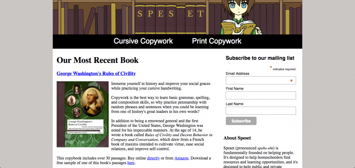
Once I had a name, I got started on the graphic design. I sketched out on paper the general idea for what I wanted to do—a young person standing in front of a bookshelf with “S P E S   E T” spelled out on book spines—then imported the image to Adobe Illustrator to create the real vector. I made sure that the image was a web-worthy 960px wide and used the “save for web” function in Illustrator (back when that was a thing, it’s called “export for screens” now) to make sure that everything rasterized nicely.

One of the biggest problems I had when creating the graphics for Speset was the color scheme. My dad’s aesthetic is dark wood and leather, so he created the book covers with that in mind. Unlike a book cover, though, a website looks kind of ugly with a leather texture, so I had to find a way to convey the same idea with only flat colors. I ended up settling on a bright gold, a dark red-purple, and a light reddish-brown. I thought I might add a wood-grain texture to the background of the site, but I decided it would be too distracting and opted for a simple warm grey instead.

After the graphics were finished, I had to get started on actually coding the website. To start with, though at this point I knew almost no PHP, I used the .php file type because there was one thing I’ve always loved to do in PHP: includes. Though I knew how to import an external stylesheet or script, I didn’t know it was possible to import another HTML file. Because I wasn’t a fan of copy-pasting code over and over, or of accidentally failing to copy a closing div tag and thereby ruining everything, I loved to use PHP includes. I still do; though I now know that HTML can do includes, and though HTML5 can do forms now (I used to need PHP for that), PHP is still more powerful than HTML, so I use it to keep my doors open.

I put my nice header image into an include, made other includes for the nav bar and footer, then went about writing content. I already had the blurbs I wanted to include—they were the same ones on the backs of the books—but I needed to figure out how to format them. Given the very small amount I knew about CSS at the time, creating a two-columned list next to an image that used a specified font size and amount of space between columns was a daunting task!

After a lot of fiddling and finnicking, I’d added all our books, the final thing I needed to do was add the mailing list from Mailchimp. The code wasn’t the hard part, since they provided the form and I just had to style it; setting up the account in the first place was a little more challenging. I eventually managed, though, and I set it up to send me emails whenever I gained subscribers to the mailing list.

Over the course of the next few years, I made a handful of improvements to the website, but mostly just added new books as they were published. One thing happened that I wasn’t expecting, though. I didn’t figure it out until earlier this year, when I started cleaning out my inbox, but when I did, I realized I had a lot of emails from Mailchimp.

At that time, I hadn’t sent out a single email to any of the Speset subscribers. I hadn’t even done a single ounce of marketing. Beyond the mere existence of the website, I had done nothing at all. And yet, I kept seeing emails from Mailchimp. After a few scores of them I thought to log in to my account and check the subscriber statistics. I blinked a few times when I saw the number. Over a hundred?! Dude!!

I’ve since realized the probable reason this happened. Before I’d created the website, the books already had a niche following on homeschooling forums: my mom had done a good job at word-of-mouth marketing. But, they were all just floating about in the Amazon aether, without anything connecting any of the books to each other. Once they all had a single home, the people who’d already cared about them were able to get to them more easily, and to recommend our products more easily. The mere existence of the website promoted both brand loyalty and word-of-mouth.

Here’s the website, by the way. Thanks for reading.

Rubber Duck Debugging: What It Is and What It’s For

Debugging in general is the act of fixing errors (called “bugs”) in computer code. Rubber duck debugging is the act of debugging by explaining your code to a rubber duck.

That’s a simple enough explanation, but why would you want to do that?

Have you ever heard the phrase, “If you can’t explain it to a six year old, you don’t understand it yourself”? The concept is that if you truly understand something, you can explain it to someone who knows nothing about it.

This isn’t just a test of understanding for concepts you already know are sound. You can use the power of explanation to find problems with concepts you came up with yourself. If you explain your logic to someone who knows nothing about it, you’ll be forced to start over from the logical beginning and explain in simple terms.

When you’re the one who created the logic, you can sometimes accidentally accept unreasonable assumptions without knowing it. If you then have to explain the logic, though, you’ll need to spell out your assumptions. And if those assumptions aren’t reasonable, you’ll know it right away.

The best part of this is that it doesn’t require a human. Your brain is good enough at personifying inanimate objects that explaining a concept to another human who simply isn’t replying is functionally interchangeable with explaining it to a rubber duck. So, a lot of programmers explain concepts to rubber ducks (or stuffed rabbits, in my case) instead of inconveniencing fellow humans.

So. What is rubber duck debugging? It’s using your brain’s powers of explanation and personification to fix logic problems.

Rubber duck debugging is hardly the exclusive domain of programmers. Anybody who can use language can explain something to a rubber duck (I don’t even have to say “anybody who can speak”, because I’m sure rubber ducks understand sign language). Writers do it to fix problems with their story plot, for example.

So if you’re ever working on a tricky problem, try stepping back and explaining it to a rubber duck.

What Is a Tech Cert, and What Is It For?

Last month, as a part of my portfolio project, I got three MTA (Microsoft Technology Associate) certifications, in Java, JavaScript, and HTML/CSS. I documented this fact through my project updates, but if you don’t know what those are, I didn’t offer a lot of explanation.

So, let me take this opportunity to explain what a technology certification is, why it matters, and why if you had to choose between some certs and a college degree, you should choose the certs.

There are a wide variety of different certs, offered by a large number of companies, which demonstrate proficiency with a ton of disparate technologies. Each cert is accorded a certain level of respect in the tech space, based on how central the company offering the cert is to the area of technology tested by the cert. For example: SQL Server, one of the most common flavors of SQL, is owned by Microsoft. As such, the MCSE (Microsoft Certified Systems Engineer) in SQL is one of the most highly respected SQL certs.

Most companies who offer certifications offer them in tiers. I’ll use Microsoft as an example. The MTA is the lowest level of Microsoft certification. After that, the next level is the  MCP (Microsoft Certified Professional), and then the MCSA (Microsoft Certified Solutions Associate). To get an MCSA, you need to pass three or four related MCP exams. The top tier is the MCSE. To get an MCSE, you need to already have an MCSA, then pass one or two additional (much more difficult) exams.

These certifications demonstrate specific things to employers. For example, “I have an MTA in this” means “I am skilled enough at this to get an entry-level job doing it”. “I have an MCSE in this” means “I am an expert at this and have a lot of experience using it”.

Tech certs and college degrees occupy very different niches. Where tech certs demonstrate that you have a certain level of hands-on skill with a specific technology or technological area, a college degree demonstrates (hopefully) that you have a broad proficiency with technology in general. Where a certification is product-specific, company-specific, and clearly leveled, a degree is more subject area focused and doesn’t necessarily include any particular language or technology, and while it does  come in levels (AS, BS, MS, PhD),  the levels correlate to time spent, more than skills earned.

If I say “I have a CCIE”, you know that I have a very high level of technical knowledge about routers and networking in general, and Cisco routers specifically (Cisco being one of the main manufacturers of routers). This is incredibly useful knowledge to employers, who now know exactly what I can do for them. If, however, I said “I have a Master’s degree in computer information technology”, you only know that I’ve spent six years immersed in technology. You don’t know what kind of technology, and if you’re an employer looking to hire someone who knows how to work with Cisco routers, you’ve got no clue if I can do that. My degree might have required one class in networking, or ten, or none at all. You have no idea.

It’s not just that degrees can be highly unspecific and not very useful to employers looking for specific skills. When someone says “I have a degree”, you don’t even know if their knowledge is up-to-date.

Certifications are always up-to-date, in one of two ways. Some certifications are only valid for a certain amount of time. For example, the CISSP (Certified Information Systems Security Professional, a cybersecurity certification) expires after three years, at which point it needs to be renewed. Other certifications are version-specific. For example, if you get an MCSE in SQL Server 2012-14, you have it forever, but you’ll probably want to get one in SQL Server 2016 as well once the newer version becomes ubiquitous.

But a degree doesn’t work like this. Once someone is taught a thing in a class, there is no requirement that they maintain that knowledge to keep the degree up-to-date. Furthermore, the thing taught in the class may not even have been up-to-date at the time it was taught. A lot of colleges have reputations for teaching things that are out of date, not out of malice, but because tech changes faster than colleges can. It’s rare to find college classes that teach the latest and greatest, and it’s common to find colleges teaching material that’s out of fashion, unnecessary, or just plain obsolete.

There’s yet another problem with degrees: they aren’t vendor-specific. I mentioned the CCIE before: the networking certification offered by Cisco. That last part is important. The benefit of a CCIE isn’t just that it says “This person knows routers.” It’s that it says “This person knows routers. Sincerely, the guy who makes the routers.” With a degree, it’s like “This person knows how tech works. Sincerely, a college that you may or may not have ever heard of.” So it’s not just the lack of information, it’s also the lack of credibility behind that information.

It is also important to note something kind of unique about tech: many of the seasoned working professionals in the tech space don’t have degrees in tech. This is because when these professionals were starting out in tech, the field was so new that there weren’t many degrees in it. They got degrees in other things: math, electrical engineering, underwater basket weaving, whatever. The thing that made them tech professionals was their technical knowledge, not what came after “BS in” on their resume. And nowadays, with the advent of certifications, these professionals have MCSEs or CCIEs, not college degrees.

Basically, if you have to choose between a candidate for your job who has a college degree in technology, and a candidate who has no degree but has several certifications and a good portfolio, you’re going to pick the latter. Even so, there is a reason for degrees in tech to exist besides “colleges wanted to jump on the tech bandwagon”.

Firstly, college degrees in tech demonstrate a commitment to learning technology over an extended period. Since you can get certs over however long you want so long as you keep them up-to-date, an employer has no idea whether the candidate with three certs has spent one year or five learning that material. College, by contrast, has a consistent, fast pace, so an employer can infer from a college degree that the candidate is capable of maintaining a high workload for an extended period of time.

Second, college degrees are designed to give you an understanding of the fundamentals of the field you’re entering, including at least the basics in the breadth of the field, plus some significant depth in at least one area. A major downside of having only certs is that you may not have a good foundation: you may be a one-trick pony who knows only one thing, and may do that one thing well, but may not know about how it fits into the bigger picture, what it depends on, or what depends on it.

The big advantage of a degree is that you’re going to come out of it with a general understanding of every major sub-discipline. You come out of a degree in tech with a general knowledge of networking, operating systems, electronics, math and logic, and programming. This is generally how every degree works, and it is in fact a valuable service that colleges provide.

The theoretical ideal candidate has both a degree in technology (for the breadth of knowledge and commitment) and multiple certifications (for specific, up-to-date knowledge about vendor technology). Often in the real world, though, employers will pass up someone with a nice shiny degree in favor of someone who has the right certs and a good portfolio.
Why to Use CSS Instead of JavaScript for Your Menus

Before I start on this post, if you haven’t read Good Tech Things to Know, I recommend you read that one first. I’ll be referencing what I wrote in that post for purposes of explaining the tech in this one. If you already have a basic understanding of what both JavaScript and CSS are and what they do, you’re welcome to hang out here, but the link’s still there if you need it.

That said, let’s dive into a lesson I learned very recently: why to use CSS instead of JavaScript for menus.

To start off, let’s explain what I mean by “menus”. A menu is just a place that a user can go to choose from different options; just like in a restaurant. In the context of websites and applications, menus can be used for navigation, selection, input, and more. There are a number of types of menus, but one of the most common, especially for navigation on websites, is a drop-down. Here’s an example. You can hover your mouse over the square labeled “Two” and get four additional options. Here’s another example. You can click on any of the squares with arrows and access additional options. This example is a bit more complicated, since hovering over some of the options shows yet more. Still, both are the same style of navigational menu.

The first example menu is created with CSS. The second is created with JavaScript.

It’s pretty easy to understand how you could create a menu like that with JavaScript. After all, JavaScript is a programming language, and programming languages can make decisions and do things. The decision for a drop-down menu goes something like, “if the user hovers over the square labeled ‘Two’, then display the drop-down; if the user stops hovering over any part of the menu, then stop displaying the drop-down.”

But if you recall, CSS is a markup language. It doesn’t make decisions and it doesn’t do stuff, it just styles HTML. So how exactly is it possible to make those decisions using CSS, and why am I saying it’s preferable to do so?

To answer the first question, I’m going to delve a bit more into how CSS works. Don’t worry; I’ll make it easy.

The basic structure of CSS is a bunch of commands that look like this:
property: value;
For example, take the statement “color: blue”. Color is a property which tells the computer what color a piece of text should be. It has a huge range of possible values. Blue is the specific value of the color property that we want to use in this circumstance.

A lot of the time, CSS properties don’t have such obvious names. For example, what do you think “margin: auto” does? It’s not obvious by reading the property name, so the programmer needs to know by rote. (Which this programmer does. “margin: auto” centers something.) So, the process of coding CSS is essentially translating between what you want the computer to do, and what properties you should set to what values to make that happen.

For purposes of creating drop-down menus with CSS, the single most important property is “display”, and the most important value of that property is “none”. Basically, “display: none” removes something entirely from the page. It’s like a CSS backspace key.

This “backspace key” is really useful for doing things like removing a drop-down menu from the screen when the user stops hovering over it.

So if that’s the “then” part of the statement “if the user stops hovering over any part of the menu, then stop displaying the drop-down”, how do we code the “if” part? How can we tell whether or not the user is hovering over the menu?

Fortunately for us, the part of the computer that figures out whether or not the user is hovering over the menu is not programmed in either JavaScript or CSS. It’s built into the web browser itself. So, both languages have the capability to figure that out. In JavaScript, it goes
if (!event.target.matches('.nav'))
In CSS, it goes
.nav a:not(:first-of-type) { display: none; }
Don’t worry about not understanding those code snippets, I just wanted to show them to you to demonstrate how different the same basic code looks in different languages.

So, we’ve got both pieces. We’ve got the decision, and we’ve got the action. And so, we can program drop-down menus with CSS, even though it’s not technically a programming language. Pretty cool, eh?

Now, I did previously say that not only is programming menus with CSS possible, it’s actually preferable. There’s one simple reason for this: ubiquity.

An unfortunate fact of life for web designers is that not everyone is going to be seeing your website in the same way. Their screen size could be bigger or smaller, or have different proportions. Their browser could be different from the one you use, or it could even be text-only. They may have some extensions enabled that you’ve never heard of, and they may not have extensions enabled that you use daily. And every one of these differences affects how that user will view your website. If your website isn’t usable to everyone on every device with every setting, you’ll drive away a ton of potential customers.

I bring this up because JavaScript is actually one of those potential differences between you and your users. There are a lot of people who don’t have JavaScript enabled. If you program your website’s navigation using JavaScript, your website will be completely unusable to someone who doesn’t have it enabled.

Nobody wants to disable CSS, however: while JavaScript is frequently used to make pop-ups and ads visible, and otherwise isn’t used for integral functions; disabling CSS would not prevent ads from being displayed and is one of the most integral parts of a webpage.

So, CSS is ubiquitous whereas JavaScript is not, and a crucial piece of your website should not be created with a non-ubiquitous language. That is the reason that I recently deleted all the JavaScript code I had for my website navigation and decided to start over with CSS. And that is the reason that you should program your menus with CSS instead of JavaScript.

Portfolio Project: Week 4

Hey all! So for the very last update of my portfolio project month, I’ll be doing something a little different. I wanted to elaborate more on exactly what it is I’ve been doing, and I also I wanted to talk about the lessons I’ve learned overall. For all of these reasons, this is going to be a little bit of a longer post than my other updates.

What I got done

I passed my MTA JavaScript and added it to my website. This is the last MTA I wanted to get this month: I’ve now got them for almost all my major marketable skills: HTML/CSS, JavaScript, and Java. The reason I wanted to get these certifications is that they are externally recognized demonstrations of my skill. They communicate to potential employers that not only do I say I know how to program in Java, a third party recognized me for that knowledge.

I coded three brand-new pages on skills—SQL, Java, and HTML/CSS—thus completing my goal for this project. Honestly, once I stopped trying to make my skills more impressive and just decided to put them out there, it felt nice. And beyond just feeling nice, having these pages on my site gives more detail to potential employers about what I’ve done and how. My next step here is probably to ask some friends and family to read my content and give me feedback so I can add detail, improve explanations, and consolidate information. A website is really never finished, so though this project is properly done, I’m going to continue improving the pages I’ve created as well as adding new ones.

I continued to work on the drop-down menu, but I pushed it onto the back burner so I could complete my stated project goal. Actually, I talked to a fellow developer early in the week and ended up completely scrapping my previous code and starting over. The reason for this is that my previous code was in JavaScript, and there are a lot of people who don’t have JavaScript enabled. A crucial piece of my website should not rely on something that not everyone has enabled. As such, I will be programming my drop-downs in CSS from here on out. (Later, I’ll make a post talking about this decision in more detail. For now, here’s a post explaining what both of those things are and what they do.) Overall, while having this drop-down will be nice, I’ve linked all my content on my main Skills page, so it’s not at all necessary.

Also on my back-burner, I began creating a simple website for a local organization that my family has volunteered with for many years (called Schenley Park Learn to Skate). The main goal of this website is to allow people to sign up for the learn-to-skate program online, thus cutting down substantially on physical paper-pushing. Because of this objective, the project will be a good opportunity to learn how to integrate a SQL database with PHP – or in layman’s terms, to figure out how to gather information from many customers and store it all in one place.

Over the course of this month, I’ve passed three MTA exams, programmed four webpages, and made a number of miscellaneous fixes and improvements to my personal website, including improving mobile usability.

What I learned

Throughout this project, and especially in the last two weeks, I learned how easy it can be to fall prey to “scope creep”, or the natural way that humans accidentally allow themselves to work on a part of a project beyond its initially stated scope. For example, instead of learning skills and programming pages, I allowed myself to spend a lot of time on trying to code complicated features. It’s human nature to be distracted by shiny objects, but it’s human necessity to avoid that tendency, especially in the context of projects on deadlines.

I also learned the importance of work-arounds. If you’ve got a crucial piece of a project that’s not working, the appropriate response is not to put the entire project on hold to fix it; the appropriate response is to find a suitable work-around (there is nearly always a work-around, though it may be less efficient or elegant), continue with the main goal, and work on the piece you originally intended in the background.

Lastly, I learned more solidly than I ever did in school how much I know and how much I don’t. The school system (both high school and college) is based on levels and labels, but the real world is based on tasks. Someone who’s in school says “I’ve taken five classes in web development”. Someone who’s working in the real world says “I can program a responsively-designed website which conforms to XHTML specifications and which utilizes JavaScript, PHP, and SQL”. Within the span of a few months, I’ve transformed from the first person into the second.

I think this is a very good thing. It’s all well and good to say “I took a class in X”, but if your audience doesn’t know a lot about the specifics of the class and what it taught, they can’t translate that statement into what you can do. And for employers, who are looking at your website with a question (implicit or explicit) of “can this person do X thing I need”, a list of concrete skills is infinitely more useful than names of courses.

workflow for the week and the month

For this week, I honestly spent the vast majority of the time I didn’t spend working for money on writing content and coding. I really had no free time between those two things. It was kind of a throwback to my yearly cramming that I used to do every April in high school: every AP test, otherwise known as literally the only test that matters when taking an AP class, happens in May, so April is cram time for literally all of those classes. This past week was like that.

Still, this week there were no major setbacks, and I mostly got the opportunity to just focus on what I needed to do and Get Shit Done.

If I look back over the entire month on a day-by-day basis, it was sporadic due to a variety of internal and external factors. But I’ve noticed that all humans seem to be like this. Look at a human on a daily basis, they’re all over the place. One day is spent working incessantly and the next is spent getting almost nothing productive done at all. Or maybe one week is productive, but the next week is in shambles. The thing is, to understand any human you need to zoom out and look at trends. Look on a monthly or yearly basis instead of a daily one, and that will tell you how you’re doing.

Was I more productive today than yesterday? No. But it also doesn’t matter. The question should be, was I more productive today than last year? And the answer to that question is, yes, by leaps and bounds. Because on the whole, I’m trending upward. I’m allowed to have bad days. I’m even allowed to fall deathly ill and basically cease to exist on Earth for a week. The goal isn’t to be perfect every day, the goal is to look at where you are right now and compare it to where you were a year ago and see substantial improvement.

Did I meet my project goals?

Simple answer, yes. When I started this project, I had a very specific and achievable goal, and despite the setbacks of being sick and getting distracted, I achieved it. For four different skills,  I improved at a certain skill, and I also wrote content about that skill and added information about the skill to my website.

I decided on this goal in the first place because I knew I needed more content out there for employers to look at. Without a lot of job history in my chosen field, projects and certifications are all I’ve got to go on, so my main goal this month was really to get more of those.

And furthermore, viewing this in the context of the Praxis program I’m a part of now, every section (or “module”) is designed as an intensive exercise in one very specific thing. In the spirit of this, I chose my goal as an intensive exercise in one very specific thing: demonstrating my skills. I knew it needed to get done, so I took this month, I set specific goals, and I got it done.

What am I doing next?

The next month of the Praxis program is a 30-day blogging challenge, in which I write a blog post on some topic every single day. Honestly, I’m excited. I love to write, but I haven’t had as much time as I would like to do it. Being able to add more content to this page and discuss interesting topics on this blog is going to be amazing.

See you then!

Portfolio Project: Week 3

Hey all, I’m back! So it turns out the Mega Cold I had was actually pneumonia. Yeah. I was diagnosed and promptly put on a full course of antibiotics, plus some additional palliative pills for the general misery. I’m feeling a lot better now! And as such, I got a lot more done this week.

  • Worked on adding my project to my JavaScript page
  • Dramatically improved the readability and usability of my mobile site (enlarged buttons and lists, changed font sizes, etc.)
  • Worked on creating drop-down menus
  • Also generally got my life together overall: got back to working out, job hunting, working, learning more coding skills, etc.

Here’s a breakdown of what I did and when:

  • At the beginning of this week, I went to the doctor’s and got prescribed antibiotics. For the first few days my main goals were things like “walk around” and “take a shower”. Super simple being-a-human stuff.
  • As I got better, I could work on coding in bits and pieces. I did research for my dropdown menus and looked at how other people had done it. As soon as I was well enough to code, I worked on improving the usability of my mobile site, since it was really just a bunch of fiddling with CSS.
  • Through yesterday, I did a lot more: I worked extensively on adding my project to my JavaScript page and I wrote a ton of code for my dropdown menus. However, I felt a bit overwhelmed, and I definitely felt like I was fighting an uphill battle. That was around the time I realized something, which brings me to my next point.

Here’s what I learned this week.

When I started this project, my stated goal was to create four pages to showcase my skills. Somewhere in the process, I realized that I had gotten sidetracked into trying to improve my skills, so I could showcase what I wish my skills were, not what they actually are. The problem was, I thought I was showcasing my skills, but I just kept thinking “oh, I could make this little thing better, it won’t take long”. I started working on the thing, and a few hours passed. I had part of the thing, but not this other part. I figured out how to make that other part, but then it wouldn’t work the way I wanted and I had to debug it. Before I knew it, a week had passed.

It was like I had started walking toward a huge mountain early in the day. Because it was so big I figured it was pretty close, and I could get there by that evening, no biggie. But by that evening, the mountain was still huge, and still very far away, and I began to realize that what I had thought would take a day could take a month.

So the biggest thing that I’ve learned this week is that I’ve gotten off track with my goals for this project.

Here’s how I’m going to fix that next week.

  • Rather than trying to learn more in order to make my projects better, I’ll focus on trying to showcase what I do know. I can always work on making my projects better in the future, but that wasn’t the goal for this month.
  • I’ll collate information and create my last three pages. If I can’t embed the actual code for a project (which I frequently can’t, because it frequently involves learning an entirely separate programming language/concept; looking at you AJAX), I’ll just create a video of it running and embed that, or I’ll take screenshots and embed those.

I’m very determined to finish this project and to achieve the goals I set out at the beginning, so I’ll do whatever it takes next week to make that happen.

Portfolio Project: Week 2

Hey guys, so this week is exceedingly anticlimactic in terms of progress. On Tuesday, I was struck with The Cold To End All Colds, and I’ve been nearly bedridden since then.

Here’s what I got done anyways:

  • Worked on improving my site’s mobile readability/usability
  • Learned about AJAX
  • Learned about creating nested drop-downs such as these

Here’s what I’ve learned so far:

  • AJAX is a combination of JavaScript and XHTML (a flavor of HTML, the language of webpage structure). It allows the page to be interactive without reloading.
  • As you try to create more and more powerful code, there are less and less examples readily available. There are a million “learn to make a website” guides that will teach you how to use <h1>, <a>, <img>, and almost nothing else. Learning how to make a real, simple site with a repeating image background, that is responsively designed, that uses complicated CSS and JavaScript (like I’ve done so far), is much harder. I learned recently that I need to keep working hard if I want to create the kind of website I want.
  • When you’re sick, the most important thing to do is not to worry. Focus on getting better, and doing anything you can to remedy what you’ve got. If you let yourself feel like a failure, that doesn’t make you any more productive, it just makes you less effective at combatting your illness.

And here’s what’s going to happen next week:

  • I’ll do everything I was going to do last week
  • I’ll start learning SQL via Udemy and create a page for SQL on my website in addition to the page for Java

Alright, that’s it for this week. Thanks for reading, and I’ll try to feel better so I can have more for you next Friday. Stay tuned!

Portfolio Project: Week 1

Hey all! So, it’s the end of week 1 of my portfolio project month! Here’s what I got done:

Here’s a breakdown of what I did and when:

  • At the very beginning of the week I passed my MTA Java.
  • I learned JavaScript with this course. It’s pretty good: concise, clear explanations, lots of exercises, both audio and visual resources. I’m using Udemy for both web development and SQL.
  • In the middle of the week, I took and passed my MTA HTML/CSS.
  • Then I coded the JavaScript page, though I didn’t have time to integrate the page with the rest of the site, since I was trying to find the optimal organization for pages.
  • Today, completely by accident, I realized that the mobile version of my website needs some serious reworking, so I put that into next week’s plan (below).
  • And lastly, I wrote this blog post!

Here’s what I’ve learned so far:

  • I did a bunch of research and conducted a few surveys of the optimal way to organize drop-downs on a mobile website, given limited screen space.
  • I learned that to make a website read well on a phone, not only do you need to reorganize layout, you need to make everything obnoxiously big. This is why it’s important to test mobile layouts on a real phone, not just by resizing your browser window.

And here’s what’s gonna happen next week:

  • I’ll create another drop-down menu for the Skills link on the nav bar. On mobile, this will create a nested drop-down (aka, when you hover over the Skills link in the first drop-down, another will pop out on the right-hand side which displays pages for each skill I have). These individual skill pages are where I’ll be documenting my progress through this project.
  • I’ll create another page documenting my knowledge of Java, and I’ll try to learn some AJAX so I can put the actual Java app onto the site. (I don’t know how hard a goal that is, so if it’s too hard for one week, I’ll just put up screenshots for now and keep working on it in the background. But I want to set the goal, just in case I can do it.)
  • I’ll fix the mobile version of my website to make everything bigger and more readable.

That’s it for this week! I’ll have another update next Friday; stay tuned!

How to Write CSS That Doesn’t Suck

A few days back, I read an article that ended up significantly improving the way I wrote CSS. Given how quickly and easily stylesheets can get horribly disorganized and out of hand, I found the tips to be immensely useful.

The article is primarily for teams of coders, who need to keep a ton of CSS organized such that many different people can understand it. Even so, I found a lot of it useful as an independent developer. Here are the things I found most useful:

  • Group related styles together. If you do absolutely nothing else this article mentions, do this. It is so helpful to scroll through a stylesheet and know that since you’ve run across your <p> tag styles, your <h1> styles have got to be around here somewhere.
  • After you’ve grouped related styles, try to arrange them by which page or set of pages they apply to. After that, create some suitably humungous, obnoxious, and obvious comment headers and make section headings, like this:
    /********************\
    ** ABOUT PAGE STYLES**
    \********************/
    This makes it infinitely easier to know which page you’re styling and also helps save your ass if you accidentally name a class or id something stupid and uninformative.
  • Make constructive use of white space. For closely-related styles, put only one blank line between styles; for more loosely-related styles, use 2 or 3. Put 4 blank lines before a new heading. This groups stuff up visually and makes it even easier to find what you’re looking for.
  • In terms of individual styles, use this standard format. It’s easy to read, it’s the near-universal standard, and more. Single-line CSS is almost never a good idea.
    .foo {
      display: block;
      background-color: green;
      color: red;
    }
  •  Indent full rule sets if they’re nested. For example, if you’re mobile enabling, indent all the styles inside the brackets after the @media tag.
  • If a style relies on another style elsewhere, or if the meaning of the styles is otherwise at all ambiguous, add a comment! CSS never has enough comments. I know it’s annoying that there’s no single-line comment, but seriously, you can afford to type that extra asterisk and slash to make your code readable.
  • Last tip: be very, very literal about your selectors, because the computer certainly will be. Do not say “header ul” when you mean “.nav”; even if you don’t have another ul in your header, this kind of selector generality is a very bad habit that can and will come back to bite you. Whenever you’re writing a selector, ask yourself: “do I want ALL x, or just some x?” If you want just some x, write a more specific selector. Even if you don’t think you’ll ever use the other types of x.

If you want more CSS tips, go on and read the full article! It’s a fun and helpful read, full of great info. Otherwise, that’s all for today: happy coding!